

For many years, neutral color palettes were unfairly stereotyped as uninspired, safe, or entirely devoid of personality. Many people associated a neutral interior with generic builder-grade beige walls and matching synthetic carpeting. However, in contemporary interior design, neutrals are recognized as the ultimate foundation for sophisticated, high-end environments.
Using neutral tones effectively requires looking past the idea of simply painting a room off-white and leaving it at that. A successful neutral space relies on architectural depth, subtle shifts in temperature, varied textures, and strategic light management. When executed with precision, a neutral interior acts as a calming canvas that highlights the physical forms of your furniture, the quality of your materials, and the natural architecture of your home. It establishes a timeless, flexible environment that feels layered, intentional, and welcoming.
Understanding Undertones and Color Temperature
The most critical mistake made when working with neutral palettes is ignoring undertones. No neutral paint or textile is completely pure; every shade of white, gray, beige, or taupe contains a subtle trace of secondary color that dictates its thermal personality.
The Dynamics of Warm Neutrals
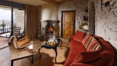
Warm neutrals incorporate underlying hints of yellow, red, orange, or brown. This category includes shades such as cream, ivory, warm beige, camel, taupe, and mushroom.
These colors are exceptionally effective at making large, airy rooms feel grounded and intimate. They absorb light gently, mimicking the comforting glow of late afternoon sun. Warm neutrals are highly recommended for rooms that face north, as these spaces naturally receive a cool, bluish daylight that can make pure white or cool gray look flat and clinical.
Mastering Cool Neutrals
Cool neutrals feature underlying hints of blue, green, or purple. This spectrum ranges from crisp snow white and icy gray to charcoal, slate, and deep pewter.
Cool neutrals introduce a clean, modern, and architectural aesthetic to a home. They bounce light efficiently and can visually expand smaller rooms by making the walls appear to recede. Cool tones show beautifully in south-facing rooms, where they help balance the intense, warm, and yellow-tinted sunlight that pours through the windows throughout the day.
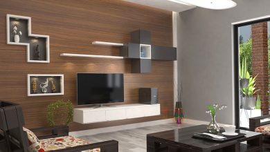
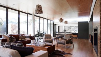
The Absolute Necessity of Tactile Texture
When you strip vibrant color out of a room, you eliminate one of the primary tools used to create visual interest. To prevent a neutral room from looking flat, sterile, or boring, you must replace that missing color with physical and visual texture. Texture behaves like a quiet substitute for color, capturing shadows and reflecting light in ways that create depth.
Layering Diverse Textiles
A well-designed neutral living space should incorporate a wide variety of fabrics within the same tonal family. For instance, if you are designing a living room around a cream and taupe palette, you can layer several distinct material profiles:
-
Boucle and Wool: Upholstering a primary sofa in a heavily nubbed boucle or a thick wool blend provides immediate physical presence and warmth.
-
Pure Linen: Utilizing lightweight linen drapery allows natural sunlight to filter through the weave, showing off the organic irregularities of the fabric.
-
Smooth Leather: Introducing an aniline leather armchair adds a sleek, rich texture that breaks up the softness of the surrounding woven fabrics.
-
Silk and Velvet: Tossing down silk or low-pile velvet accent pillows introduces a soft, elegant sheen that catches ambient lamplight.
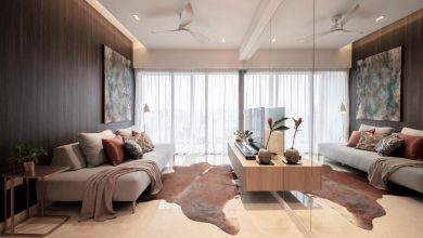
Incorporating Architectural and Natural Textures
Textures should extend beyond fabrics onto the hard surfaces of the room. Matte-finished oak floors, heavily grained marble countertops, raw travertine coffee tables, and unpolished concrete fixtures add organic variation to a neutral space.
On the walls, skipping traditional flat latex paint in favor of a subtle Roman clay plaster or a fine lime wash introduces a beautiful, velvety depth. This texture catches shadows across the wall surfaces, making monochromatic planes look dynamic and alive.
Contrast, Value, and the Rule of Black Anchors
A common pitfall in neutral interior design is keeping every item in the room at the exact same level of brightness. A room where the walls, sofa, rug, and tables are all the identical shade of mid-tone beige will inevitably look muddy and undefined.
Establishing High-Low Contrast
To create a sophisticated space, you must utilize a broad spectrum of values, ranging from the lightest cream to the deepest charcoal. Pair a pale ivory sofa with a dark espresso oak coffee table. Position a light alabaster lamp against a deep mushroom-colored wall. This high-low contrast creates structural boundaries within the room, allowing individual furniture pieces to stand out clearly rather than blending together into a singular mass.
The Role of Black Anchors
Every successful neutral room needs a point of punctuation to ground the eye. Designers achieve this by implementing the rule of black anchors.
Introducing small, strategic hits of deep black or dark charcoal prevents a neutral room from looking like it is floating aimlessly. This can be achieved through thin, architectural metal lines, such as a black iron window frame, a slender matte black floor lamp, a minimalist curtain rod, or a graphic black frame on a large piece of canvas art. These dark elements anchor the room, making the surrounding soft neutrals look cleaner and more intentional.
Mastering Light and Reflection
Because neutral tones lack intense pigment, they are highly sensitive to the lighting conditions around them. A neutral room can transform its appearance entirely from morning to night, meaning your lighting plan must be carefully calibrated.
Balancing Natural Sunlight
Before finalizing a paint color, it is crucial to test large paint swatches on multiple walls within the room and observe them at different times of day. A soft greige that looks beautifully crisp at noon might reveal an unwanted purple or green undertone during the early morning hours. Notice how the light moves through the space and choose your neutral value to work in harmony with the natural environment.
Calibrating Artificial Light Levels
When night falls, artificial lighting takes over the task of illuminating your neutrals. Avoid cool white or daylight LED bulbs, which typically sit around 4000K to 5000K, as they will make your neutral sanctuary feel like a cold commercial office or medical clinic.
Instead, specify warm-toned LED bulbs with a color temperature of 2700K. This warm light enhances the cozy qualities of creams, beiges, and warm woods. Ensure your fixtures are dimmable, and use multiple low-level light sources—such as table lamps, floor lamps, and hidden cove lighting—rather than relying on a single, harsh overhead fixture. This layered lighting casts soft shadows across your textured surfaces, amplifying the room’s depth.
Frequently Asked Questions
What is the difference between beige, gray, and greige in interior styling?
Beige is a traditional warm neutral with yellow or brown undertones that creates a cozy, classic atmosphere. Gray is a cool neutral with blue or green undertones that delivers a modern, industrial, or minimalist aesthetic. Greige is a contemporary hybrid of the two, blending gray with a warm beige base to create a highly versatile, balanced neutral that shifts gracefully depending on the light quality of the room.
Can I mix warm neutrals and cool neutrals together in the same room?
Yes, mixing warm and cool neutrals together is an excellent way to create a sophisticated, balanced space. The key is to establish one clear dominant temperature and use the opposite temperature as a minor accent. For example, you can anchor a room with cool gray walls and a charcoal sofa, and then introduce warmth through a camel leather chair, brass lighting fixtures, and a warm oak coffee table to prevent the room from looking too cold.
How do I display artwork effectively in a purely neutral room?
In a neutral room, artwork should either complement the monochromatic theme or serve as the primary pop of color. If you want to maintain a serene atmosphere, opt for large-scale abstract paintings that utilize textures, charcoal sketches, or black-and-white photography mounted in clean frames. If you want the art to make a statement, a neutral room provides the perfect gallery-like backdrop to showcase vibrant, colorful artwork without any competition from the walls.
Are neutral fabrics practical for homes with young children or pets?
Neutral spaces can absolutely be practical for families if you select performance materials. Avoid delicate natural silk or traditional cotton velvet. Instead, look for upholstery fabrics treated with stain-resistant performance technology, or choose solution-dyed acrylics, tight flat-weaves, and top-grain leathers that wipe clean easily. Additionally, opting for mid-tone neutrals like taupe, camel, or textured heather gray hides pet hair and daily dust far better than pure white or dark charcoal.
How do I choose the right rug for a neutral dining room?
A neutral dining room rug should provide texture and contrast while framed beneath the dining table. Choose a rug that extends at least twenty-four inches beyond the table edges so the chairs remain stable when pulled out. Materials like high-quality wool or woven sisal and jute are excellent choices, as their natural color variations easily mask minor crumbs while providing a distinct, grounding texture.
What metal finishes pair best with a neutral color scheme?
The choice of metal depends on the mood you wish to establish. Warm neutrals like cream and ivory pair beautifully with antique brass, brushed champagne gold, and oil-rubbed bronze, which emphasize warmth. Cool neutrals like slate and ice gray blend seamlessly with polished chrome, nickel, and brushed steel. Matte black metal serves as a universal anchor that works beautifully across all neutral color temperatures.